Using DGML to understand PX4
As you may know I have a soft spot for Directed Graphs and I enjoy showing off what you can do with DGML diagrams and Visual Studio.
I was recently struggling to debug a new problem that showed up in the PX4 Firmware with regards to Hardware in the loop (HITL) simulation and the AirSim simulator. Then I remembered I have this great tool…
See demo video:
Here’s something fun for PX4 developers. If you look in the modules/uORB folder you’ll see the pub/sub infrastructure called the “micro-orb” which is used for pub/sub messaging throughout the PX4 firmware. But knowing where messages are coming from and where they are going to can end up being quite a maze to figure out. So if we search for every instance of ORB_ID in the PX4 source code using this command:
grep -r . -e 'ORB_ID('
you’ll see lots of different uses. You’ll see orb_publish calls and you’ll see orb_subscribe calls.
So if we capture all this output of this grep in a text file orbids.txt then we can process that file with my
graph_orbids.py python script.
This script builds a graph of Nodes and Links which it can then save in a .dot or .dgml file format.
For the orb_publish calls it will create a node representing the module that is publishing with a link to another
node representing the orb topic. For the orb_subscribe calls it will create a node representing the module that is
subscribing, with a link from another node representing the orb topic.
When you run the tool it will output anything it didn’t understand, so check that output to make sure it didn’t miss anything important.
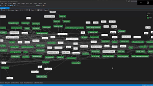
Now you have a graph.dgml file which you can load up in Visual Studio. You will see a large complex graph of all the pub/sub stuff
going on. You can use the Legend to make the topic nodes green.
But the graph is pretty big an horrendous to look at which is kind of why its so hard to debug the PX4 until you fully understand this picture.
But if you install my DgmlPowerTools extension for Visual Studio then you can slice and dice this graph a little more easily. For example, I was investigating a problem with actuator_outputs. So I can search for this topic, then select the Neighborhood Mode button in the toolbar to hide everything that is not 1 link away from this topic and you get this nice clean sub-graph:
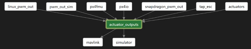 .
.
This subgraph helped me fix the bug I was hunting. I found that version 1.7 of the PX4 firmware contains the pwm_out_sim module, but version 1.8 does not. Adding it back fixed my bug and HILT mode simulation works again in AirSim.
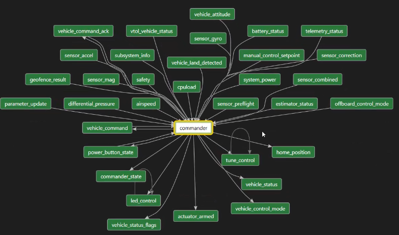
From here it’s fun to pivot around the graph recentering each subgraph on a new module or topic. For example, if you look a the commander 1 link away you see all the various topics the commander subscribes to, but you can see it is also publishing a bunch of stuff, like vehicle_status.
You can recenter the graph on vehicle_status and see what it connects to:
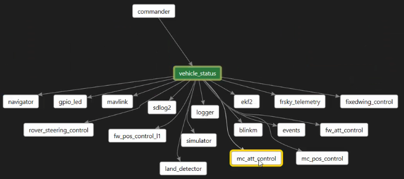
From there you can see position control module (mc_pos_control) uses this, and you can easily pivot to see that node’s local neighborhood:
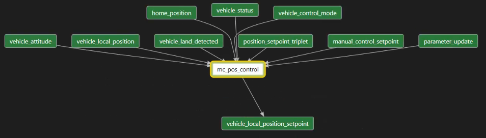
The position controller subscribes to a bunch of things and produces one output which is used to move the drone. Following that output we find that the land_detector uses this message as follows:
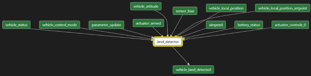
Who uses land_detected? Let’s find out:
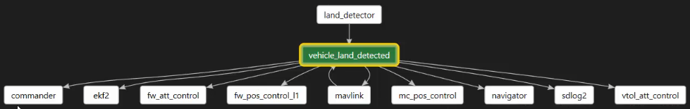
Interesting eh? Here we see ekf2 which is the fancy new position estimator
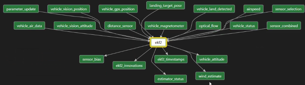
And you can see from this picture that it is doing something pretty complicated fusing together lots of inputs to figure out where the drone is headed next. One of the outputs is vehicle_attitude, which is an estimated attitude (or angle) of the drone. Let’s see who uses that:
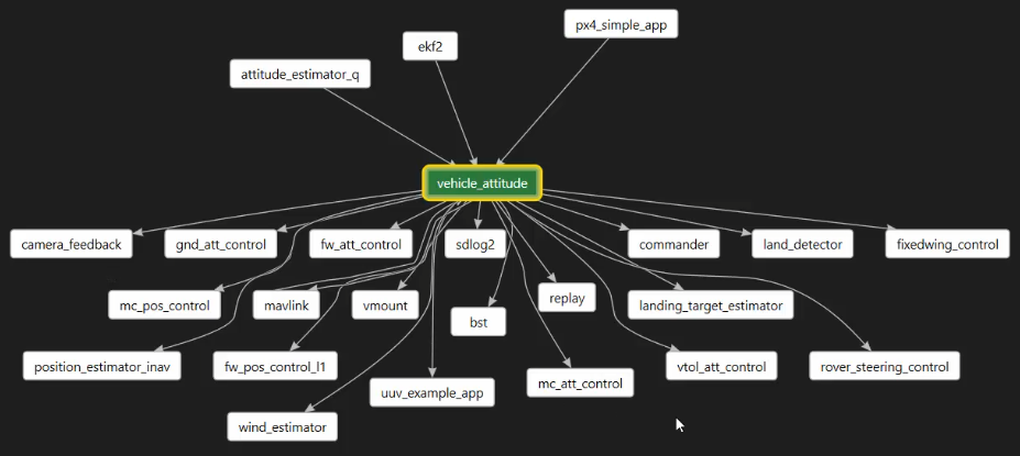
Whoah, lots of people. So you can see this is a handy way to slice and dice a complex graph. In Visual Studio you can choose different layouts like ‘left-to-right’ and find what you like best.
Anyway, I found this useful so I hope you do too.